Introduction
This section showcases data analytics and visualization projects using Tableau, highlighting key insights and findings from various projects.
Key Projects
ATB Financial’s US Branch Performance Analysis - Transitioning client activity to digital channels.
Monitoring and Evaluation Dashboard Tracker via Tableau
ATB Financial US Branch Performance Analysis
ATB Financial US Branch Performance Analysis
Transitioning client activity to digital channels using branch deposit performance data. Tableau • 2010–2016 • Banking
For a better experience, click here.
Objectives and Primary Goal
Analyze ATB branch performance to identify opportunities for transitioning client activity from physical branches to digital channels.
Specific Objectives
Identify underperforming branches or states.
Highlight high-performing branches to replicate success.
Dataset Overview
The dataset includes deposit information for ATB Financial branches from 2010 to 2016, including:
Branch Types: Walk-In, Drive-Thru
Deposit Amounts: Total dollar amounts at each branch
Geographic Locations: State, county, city, and branch details
Year: Spanning 2010 to 2016
Initial Insights
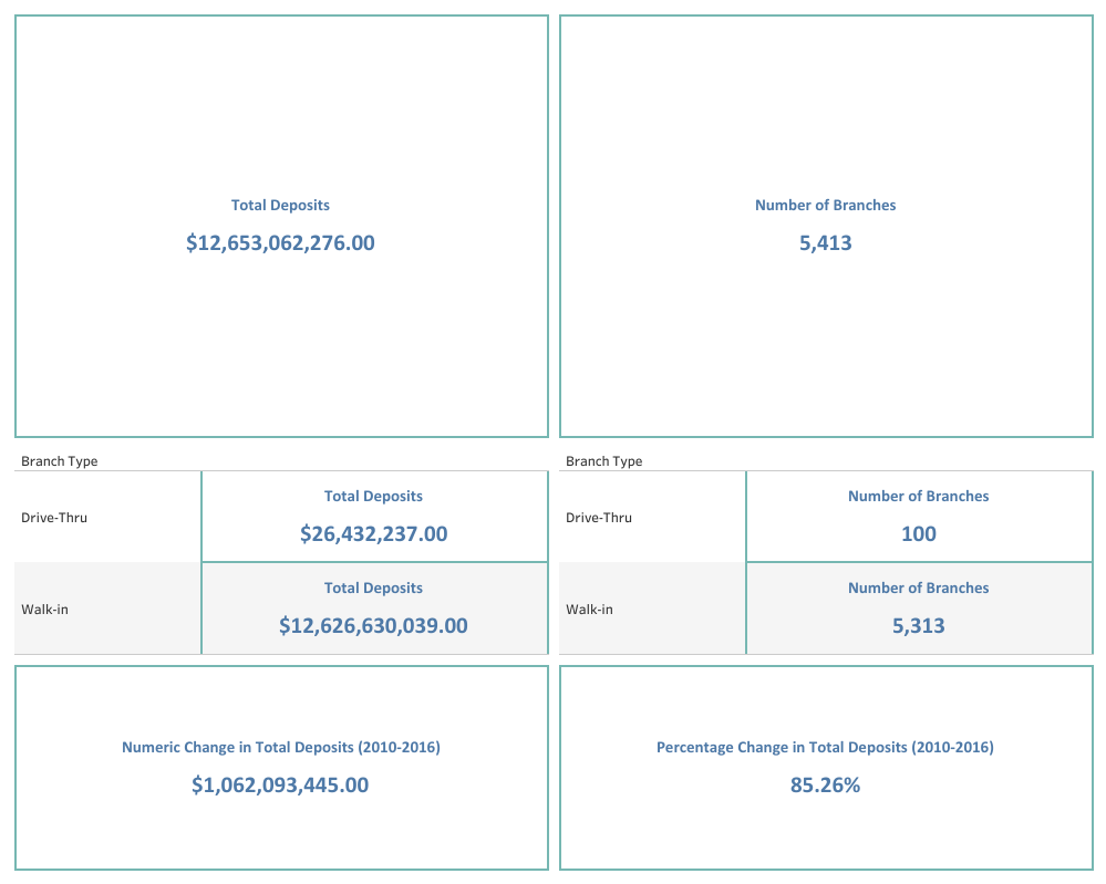
Total Deposits: exactly 12.65 billion (USD) has been deposited between 2010 and 2016. A further breakdown shows that, of the 12.65 billion (USD) deposited, 26.43 million (USD) was via drive-thrus while 12.63 billion (USD) was through walk-in branches.
Total Branches: there are a total of 5,413 branches of ATB as of July 16, 2016 when this dataset was generated. 100 of these branches are drive-thrus while 5,313 are walk-in branches.
Average Deposits per Branch: based on these numbers, initial assumption informs that each drive-thru branch received deposits of an average of 264,322.37 (USD) between 2010 and 2016 and each physical branch received deposits of an average of 2,376,553.74 (USD) between 2010 and 2016.
Key Findings - Deposit Trends
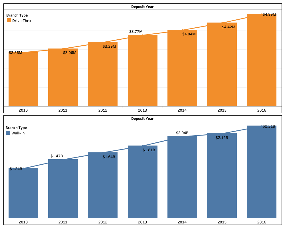
Walk-in branches have higher deposits (in billions).
Drive-thru ABMs show consistent growth potential similar to walk-in branches.
At this level of granularity, the observed difference can easily be attributed to the number of branches in each category as well as their popularity and general technology adoption.
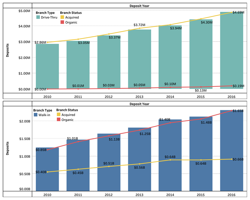
Additional level of details shows acquired branches contribute over 90% of deposits recorded at drive-thru ABMs. This is in contrast to what is observed in walk-in branches where organic ownerships are largely responsible for deposits.
Could this be a function of a great acquisition team, number of branches for each ownership type, geography, or a hybrid of some or all of these factors?
Key Findings - Geographic Distribution
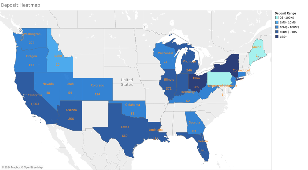
Deposits heatmap reveal Ohio and New York as the largest deposit contributors for the entire US market. However, it is interesting to highlight that the State of Pennsylvania, despite being sandwiched between the two highest contributing States, actually recorded $0 in deposits.
Recommendations
Target High-Performing Regions: Focus on states with high deposits and favorable GDP per capita.
Divest Low-Performing Regions: Close branches with consistently low deposits.
Enhance Digital Channels: Incentivize web and drive-thru services to foster adoption.
Customer Support: Provide localized support for non-tech-savvy customers.
Monitoring and Evaluation Dashboard (Agriculture)
Monitoring and Evaluation Dashboard (Agriculture)
Tracking recovery status of submitted produce during early harvest aggregation. Tableau • Agriculture • Monitoring
For a better experience, click here.
Introduction
In the northern states of Nigeria, a monitoring and evaluation project is underway to track the recovery status of agriculture produce. The project aims to effectively monitor the status of submitted produce during the early stages of harvest aggregation. To facilitate this process, an innovative dashboard was created using a combination of modern technology tools and data visualization techniques.
ETL Process
To create this dashboard, an ETL process was used to extract data from various technology partners’ APIs. This involved a daily scheduler using Prefect as an orchestration tool, which helped to automate the data extraction process. After the data was extracted, it was then transformed and cleaned using Pandas to ensure that the data was consistent and accurate for loading into the data warehouse (GCS buckets). Finally, the data was visualized using Tableau, with the data source being Google BigQuery.
Main Findings
The resulting dashboard provides a simplified adaptation of a more robust solution designed to effectively track and monitor project status. The dashboard displays the submitted produce in terms of bags, with sizes ranging between 50kg to 100kg. One of the most notable features of the dashboard is the map adaptation analytics, which offers flexibility and easy visualization of the data. Although the dataset mirrors real-life scenarios, it was slightly altered due to patent rights.
Conclusion
The creation of this dashboard has provided an innovative solution to the challenges faced in monitoring and evaluating agriculture produce in the northern states of Nigeria. Through the use of modern technology tools and data visualization techniques, the project has been able to achieve its objectives of effectively tracking and monitoring project status.